This is the first in a series of collaborations between TENDER (now Heft) and generative artists.
an intro
Within each of us resides an evolutionary history of primal emotions, yet we often spend our lives dulling and controlling these instincts rather than reveling in them. Art is one of the ways we best express those instincts and intuitions -- accessing and visualizing their visceral qualities, and releasing our deepest emotions in a way we can share.
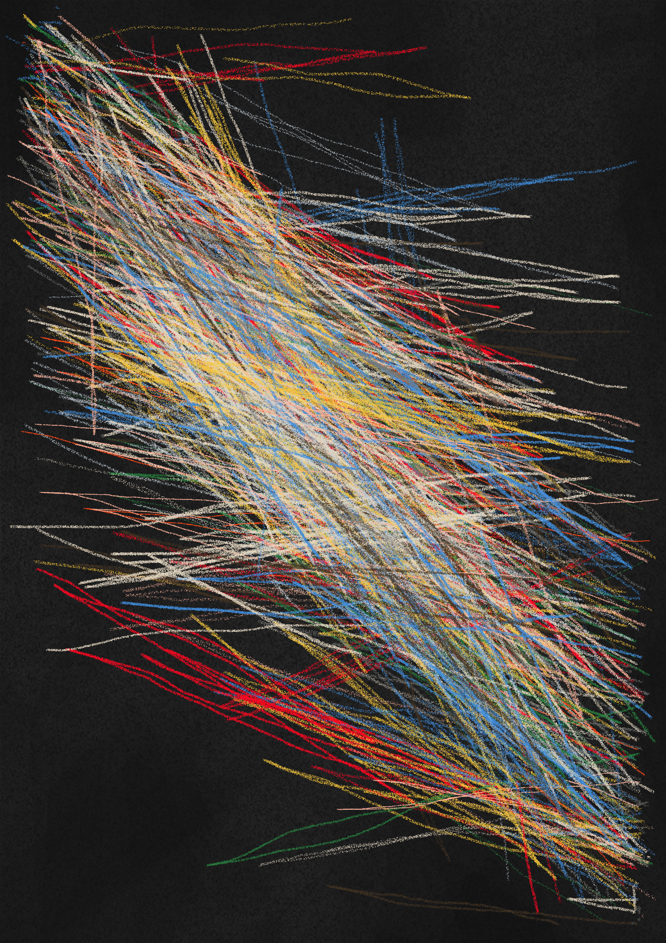
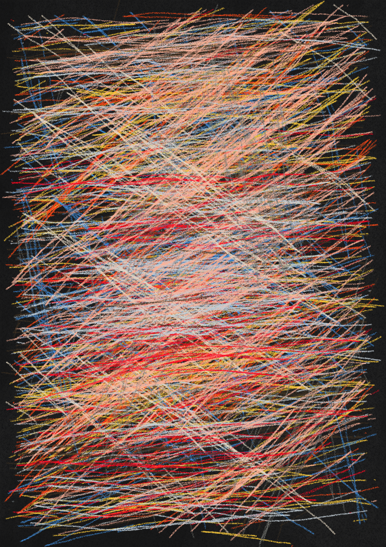
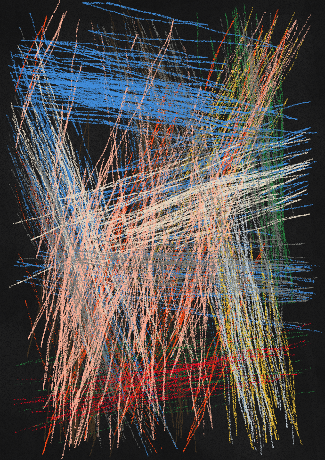
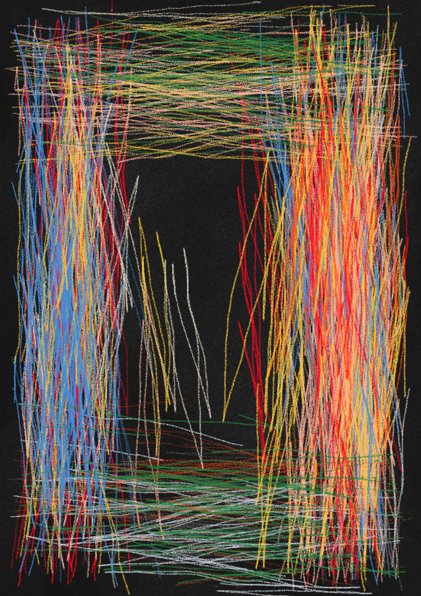
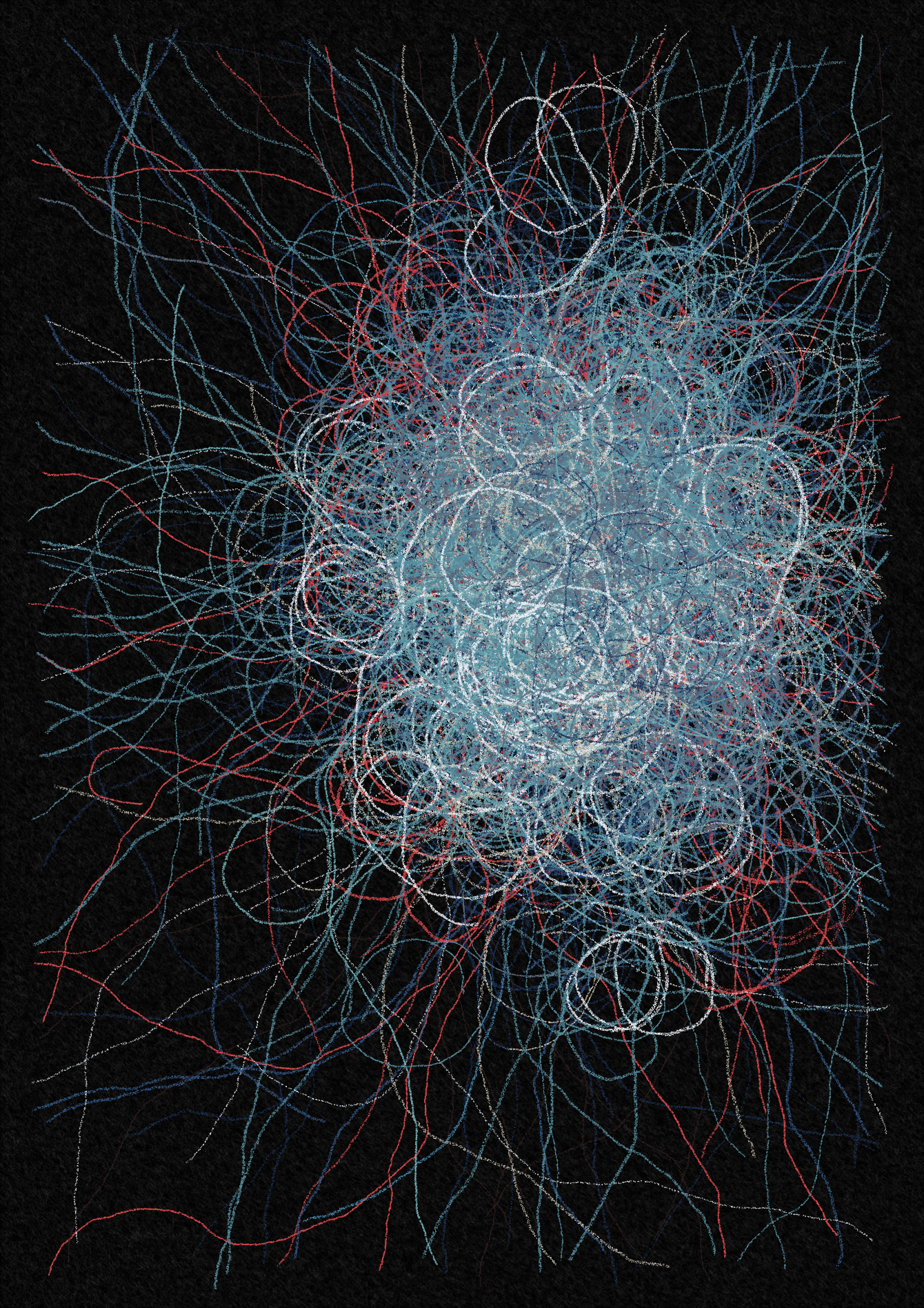
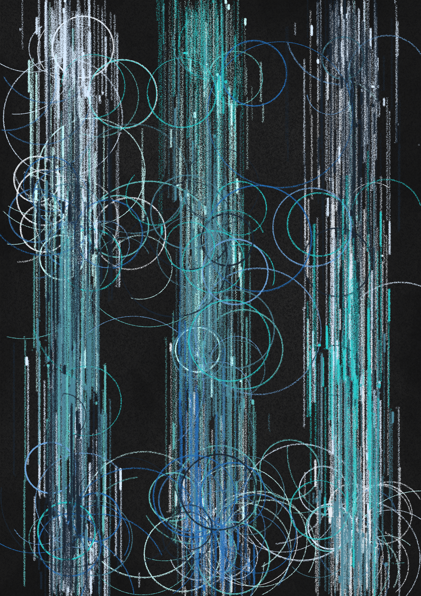
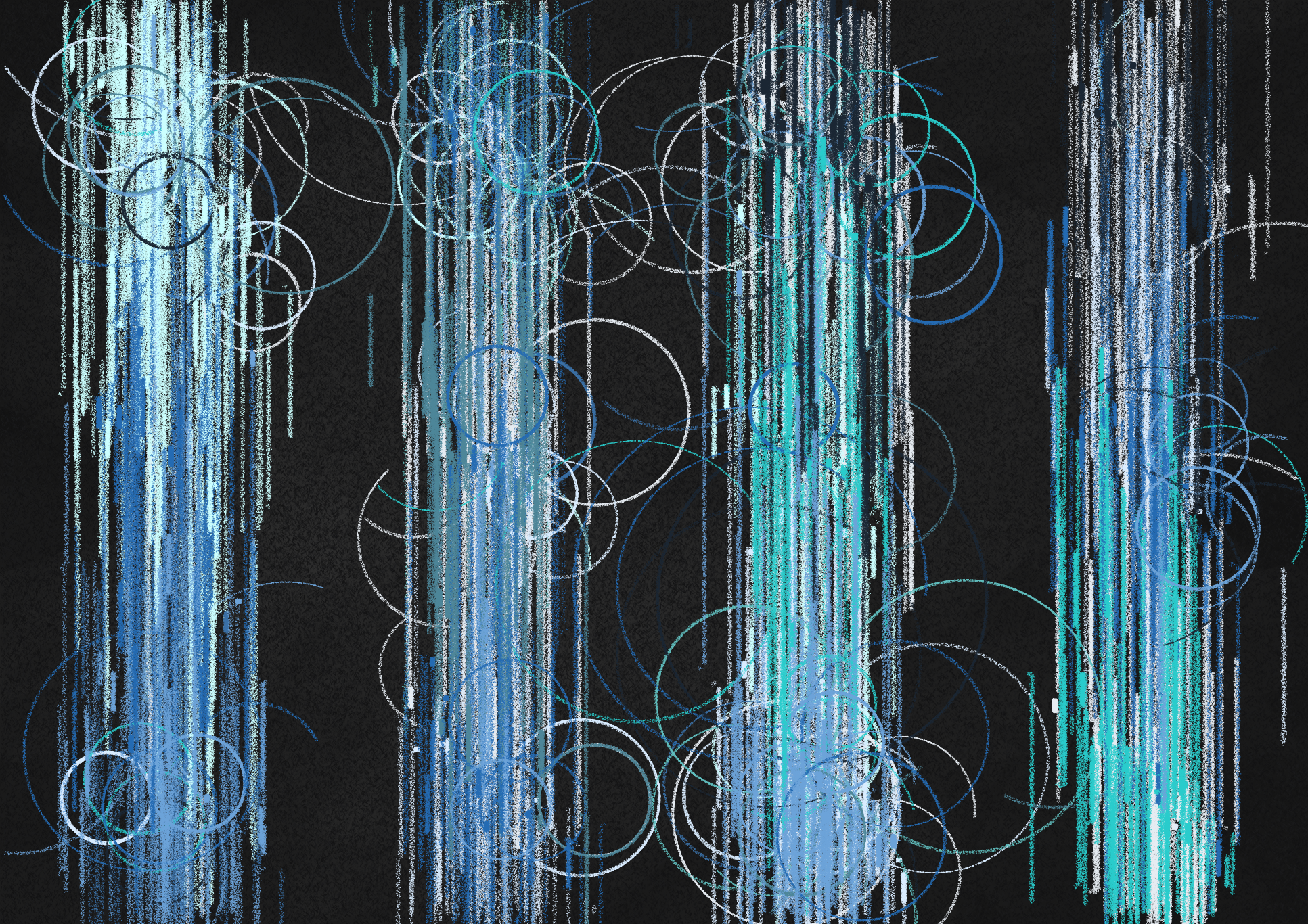
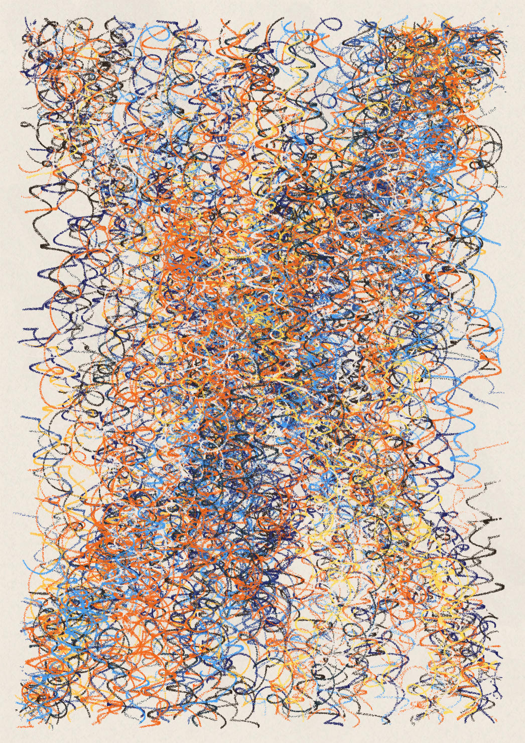
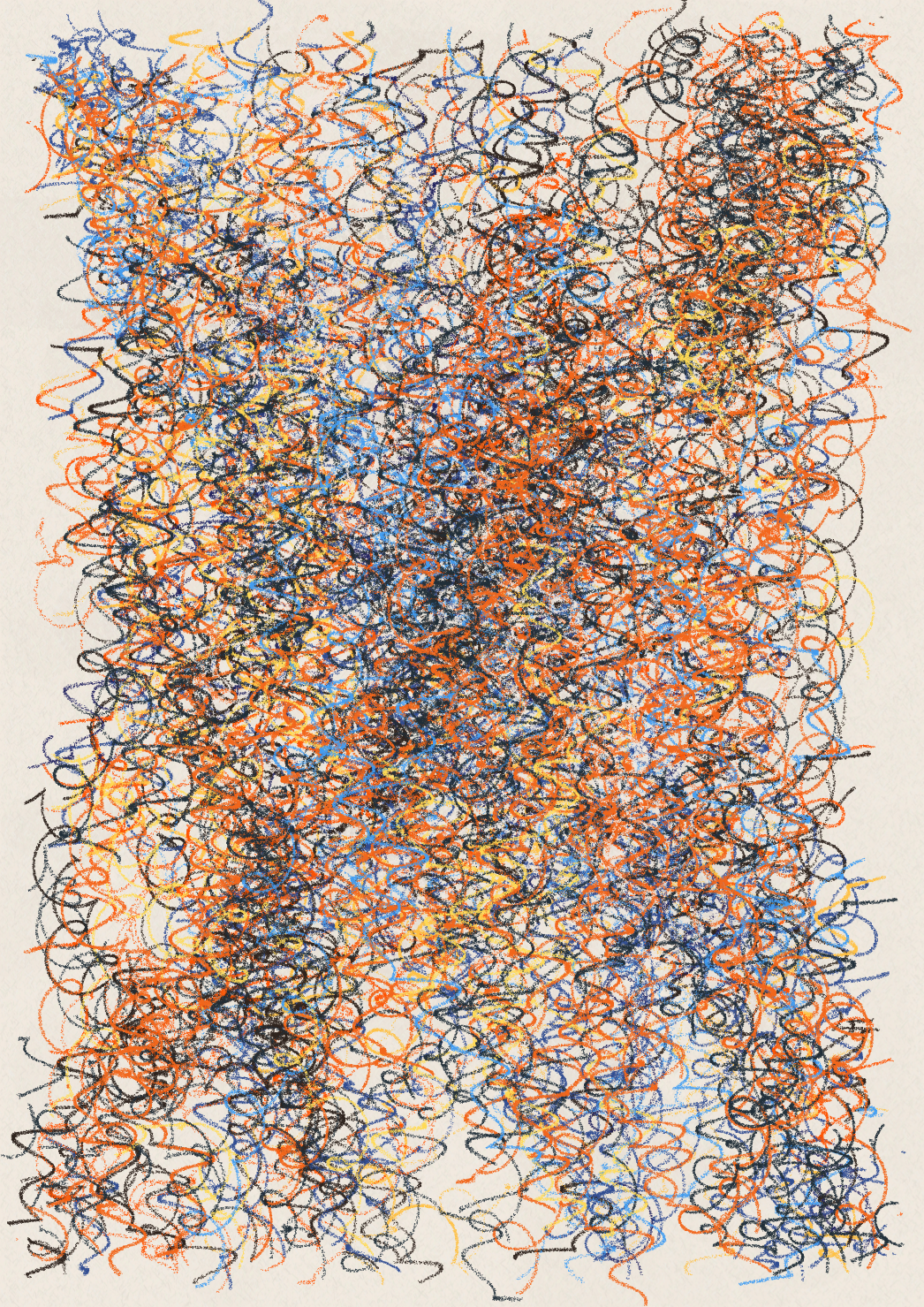
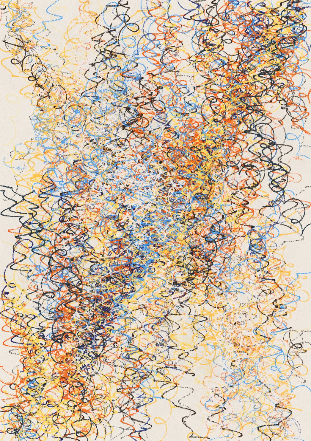
pang reflects emotions that take control of our impulses -- anguish, euphoria, obsession. By using crayon-like marks, the artworks convey the catharsis felt while drawing with a childlike abandon. To capture what gives such marks true feeling, the works deliberate the intrinsic movements, pressures, and angles shaped by hands in various moods. These qualities and their frenetic meanderings represent the infinite possibilities of where the crayon could go next -- if only we could free ourselves from the layers of control we've built.
The contradictions we struggle with are reflected throughout the works: in the long, methodical, and mathematical path to creation that yields work that looks fast, free and unrehearsed; through the randomly-informed computer generation of art that feels human; and by the depiction of long-standing traditional techniques to help display the conceptual range of a young, innovative art movement still establishing its pivotal place in the canon of art. These tensions parallel the work's underlying concept, accentuating the suspicion that a learned fear of emotional expression might just be the source of our own pang.
Created in p5.js, pang is inspired by the emotional works and processes of later abstract expressionists such as Cy Twombly and Joan Mitchell -- as well as contemporary artists like José Parlá.
a note from abstractment
Collaborating with ajberni was amazing. First, he has incredible attention to detail. I shared over 3,000 WIPs (works-in-progress) with ajberni, and I was consistently amazed at how he would pick up on small (many times, unintentional) changes. Second, his fantastic writing really made tangible the depth of what we were trying to create. Third, he had a laser-focused vision. While this was apparent from the beginning, I remain in awe of his unwavering ability to maintain that focus throughout the entire collection (e.g., palettes, stroke widths, stroke marks, etc.). Last, but quite possibly the most important, he brought a wealth of knowledge and experience that was foundational to pang, but also enriched me as an artist. As a few examples, here is how I'll be approaching my work differently in the future.
- I'll be less likely to rely on random for generating compositions.
- I'll be more focused on the meaning behind the work, asking myself several key questions... Why am I creating this collection specifically? What's the message that I want to send? How will this collection help advance the generative art movement?
- The previous point will also result in me focusing more on creating than discovering.
a note from ajberni
Through the entire collaboration abstractment maintained a truly inspiring balance of openness, and strong point of view -- bringing a thoughtful approach, an exceptional drive to discover / create, true dedication to figuring new things out in code, and a true 360 view of what he, and we, wanted to create.
As an artist (non-generative), creative director, and collector, it was an honor to splice my own points of view into a collaborative effort with an artist I so deeply respect. I view the process of creation as the same across media, and across phases of any project: it's an act of self-editing -- from the most intuitively fluid editing that one doesn't even think about, to the thoughtful deliberations needed to cull knowledge and experimentation into new paths.
Pang clearly would not exist without abstractment's rigor, creativity, and their entire generative development of this project. Both myself and Tender (in its efforts to support the generative art movement) have the greatest gratitude to abstractment for everything they put into this.
a note on crayon marks
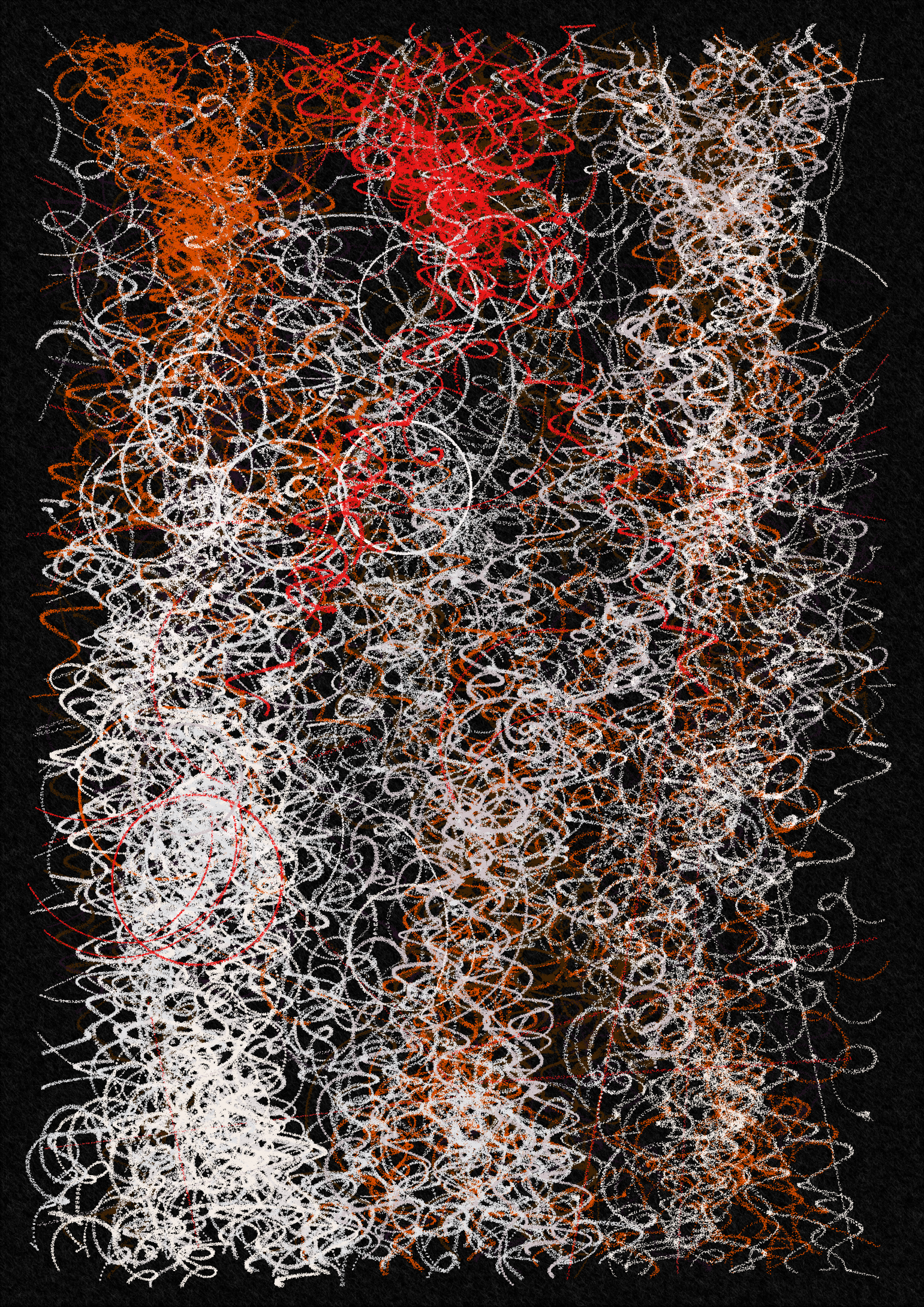
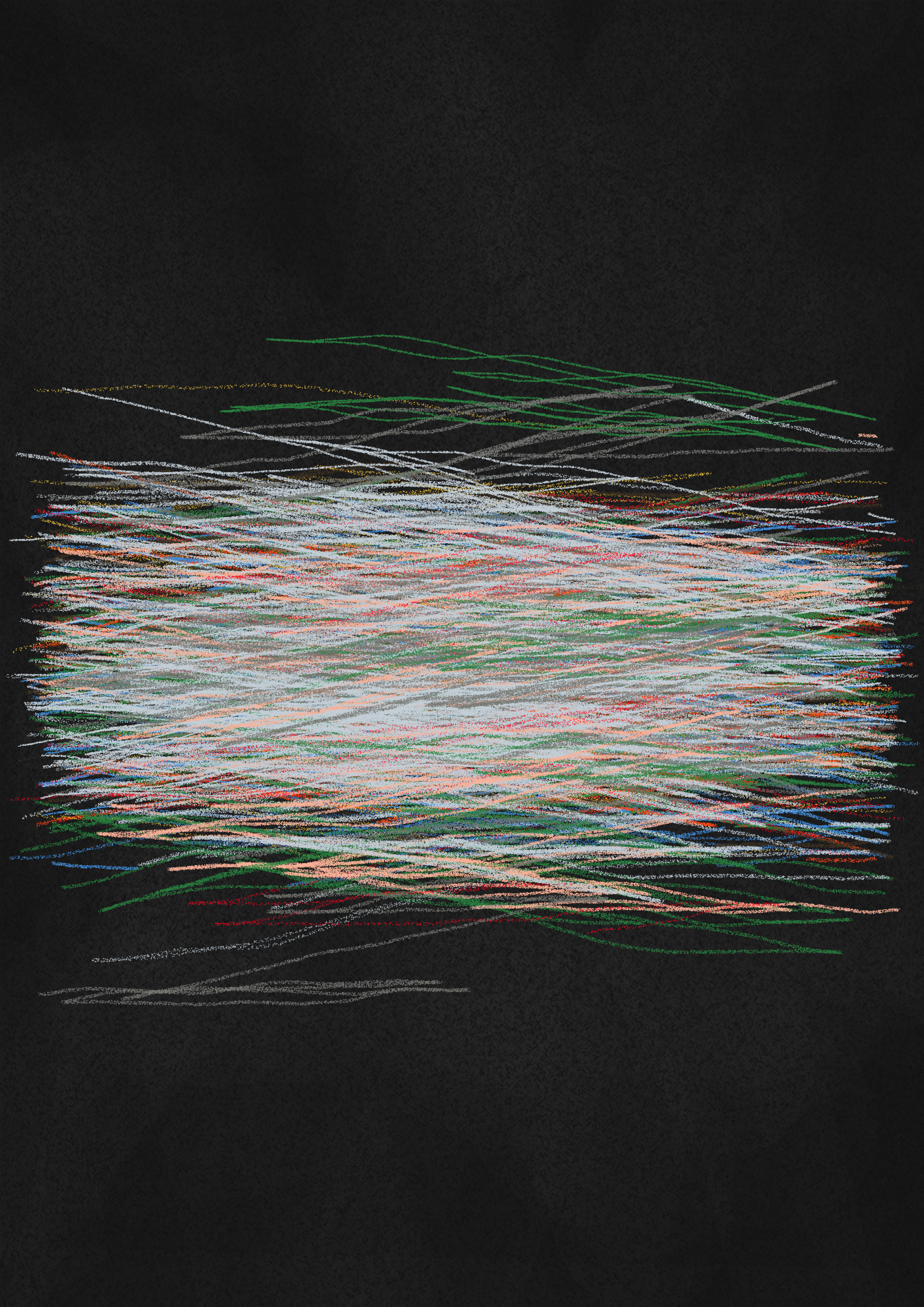
Each output uses 1.25 - 3.5 million (very tiny) points to create the stroke marks. When I originally created the pang crayon effect, it was a bit more complicated than necessary, and it resulted in me having to redo the code multiple times. This was especially challenging as we amped up the energy and intensity of pang.
To get the details right, every few days I pulled out my kids crayons to study the stroke marks. One key piece to emulating natural movement was creating smooth variation within the strokes, particularly in their width (how the crayon is held) and density (how hard it is pressed). The strokes portray varying pressure by placing more points in a concentrated area, and varying width by varying the crayon stroke technique (see below). Both of these features are amplified through the angles of curves and the ending of lines, similar to what happens when drawing naturally. I was able to get this right thanks to the easings.net resources. I'd like to give a huge shout out to @amygoodchild for her What is Generative Art? article which introduced me to this resource.
When you look at the thumbnails of pang, you might consider the lines very thin for crayon marks. This is intentional as pang is designed for larger print. One unanticipated challenge with the points (which create the crayon marks) was that they were so small that they disappeared in the high-quality renders needed for large prints. A huge thanks to @rich_poole for helping me figure out how to adapt the artwork to account for this.
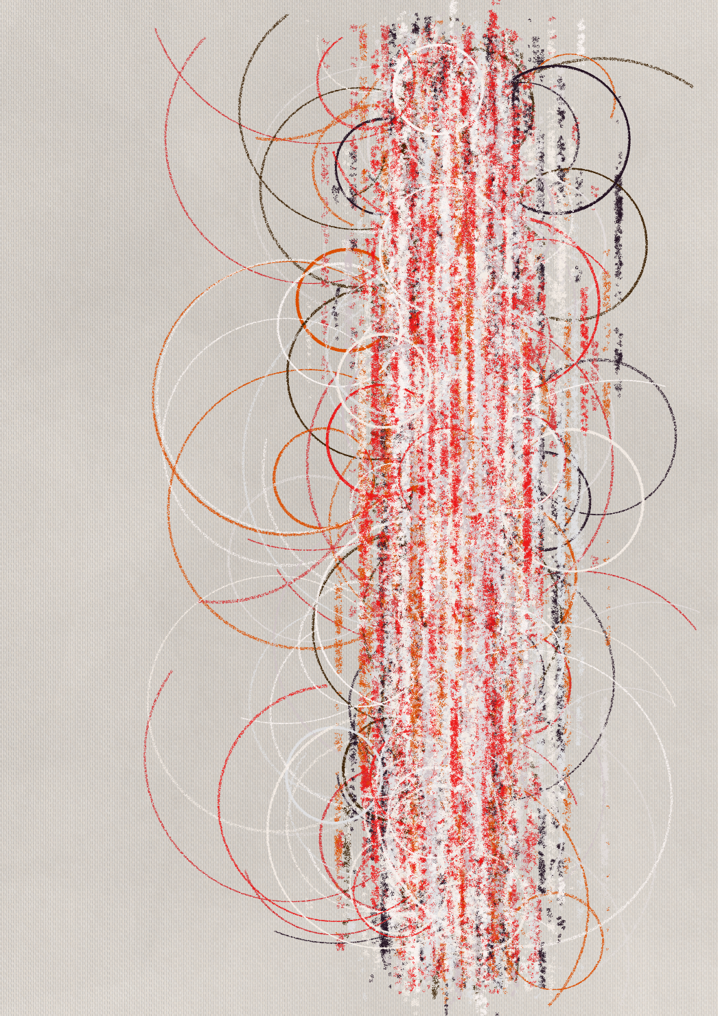
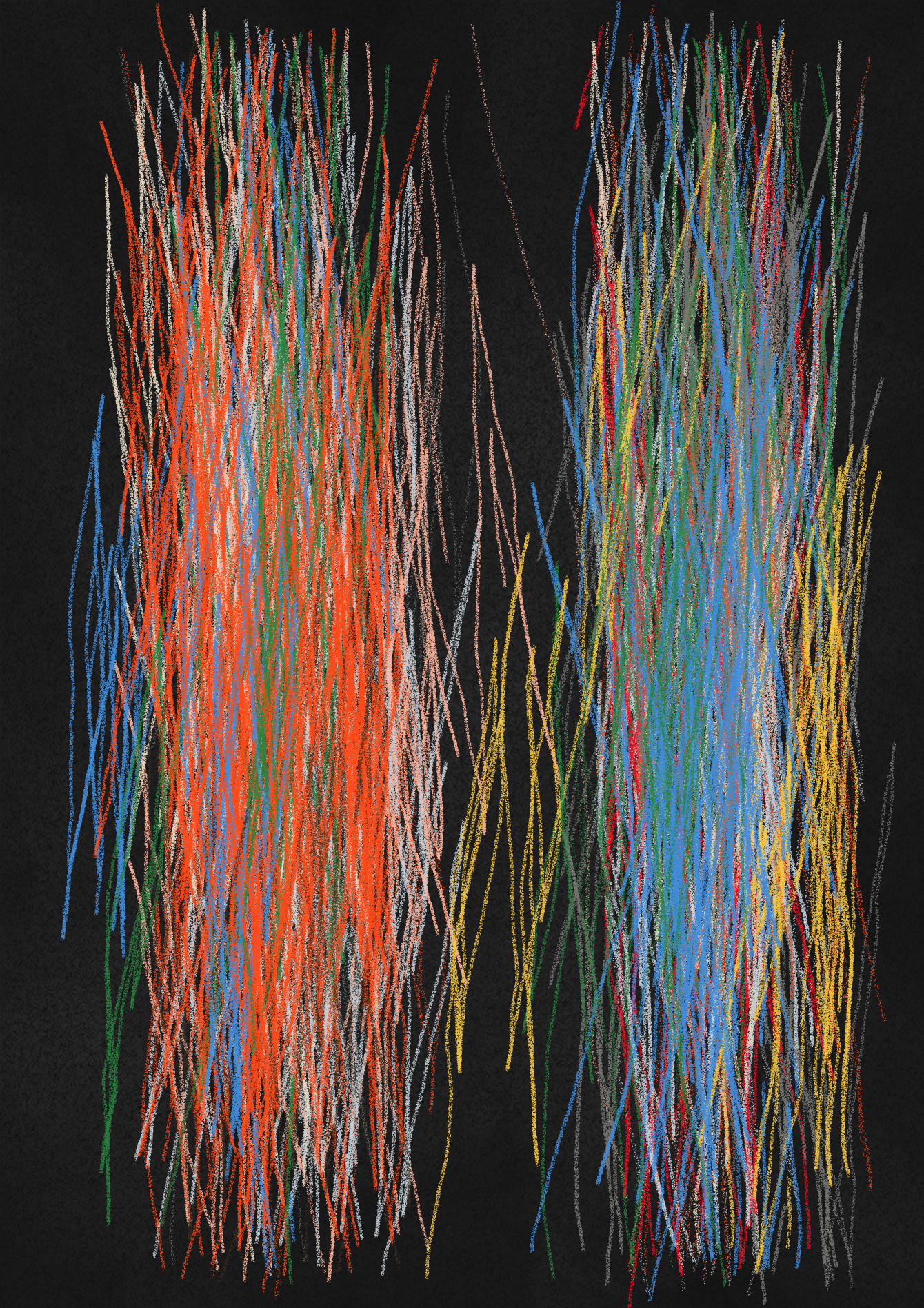
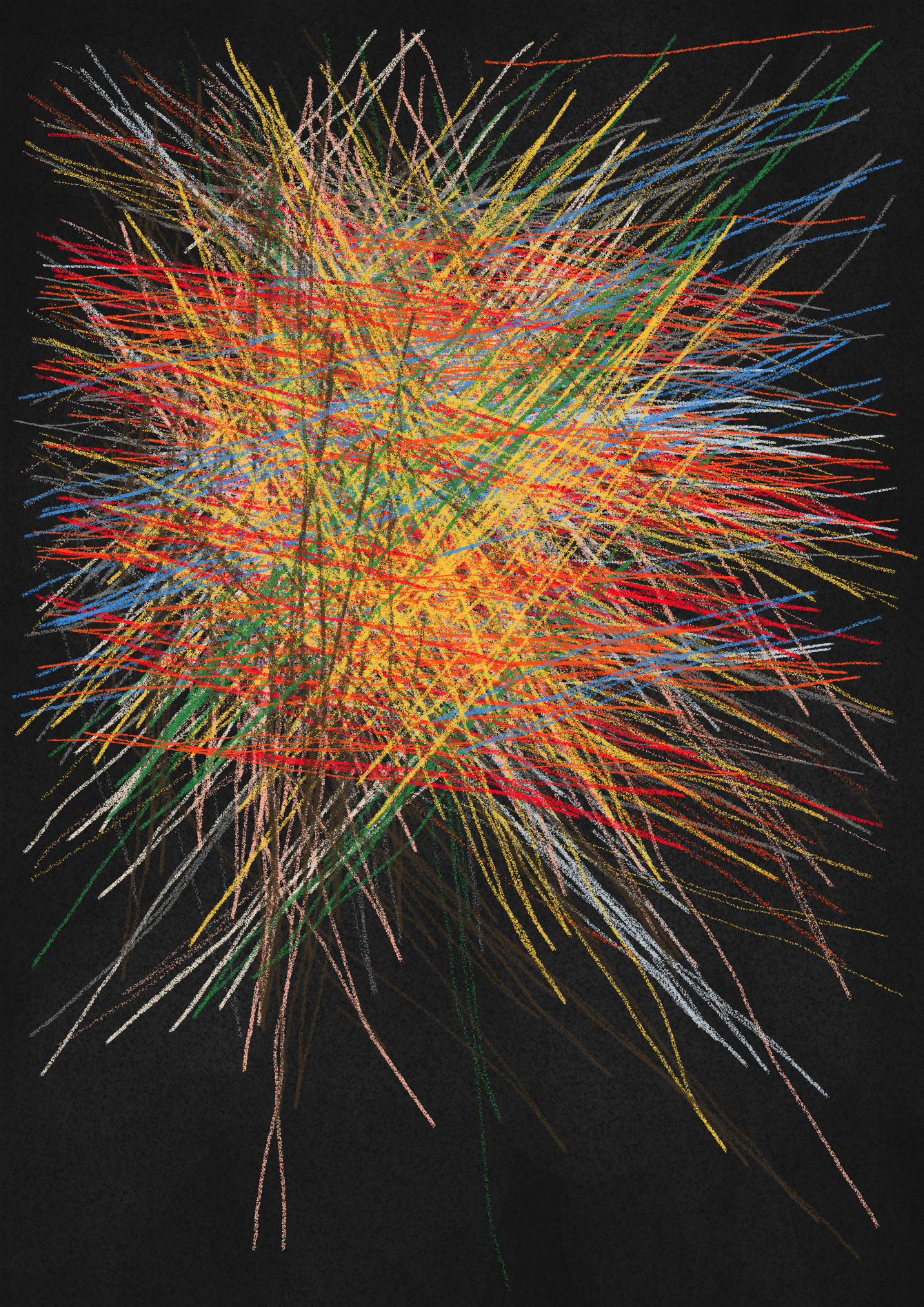
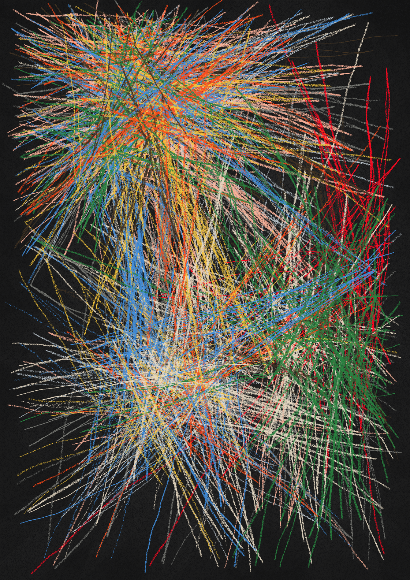
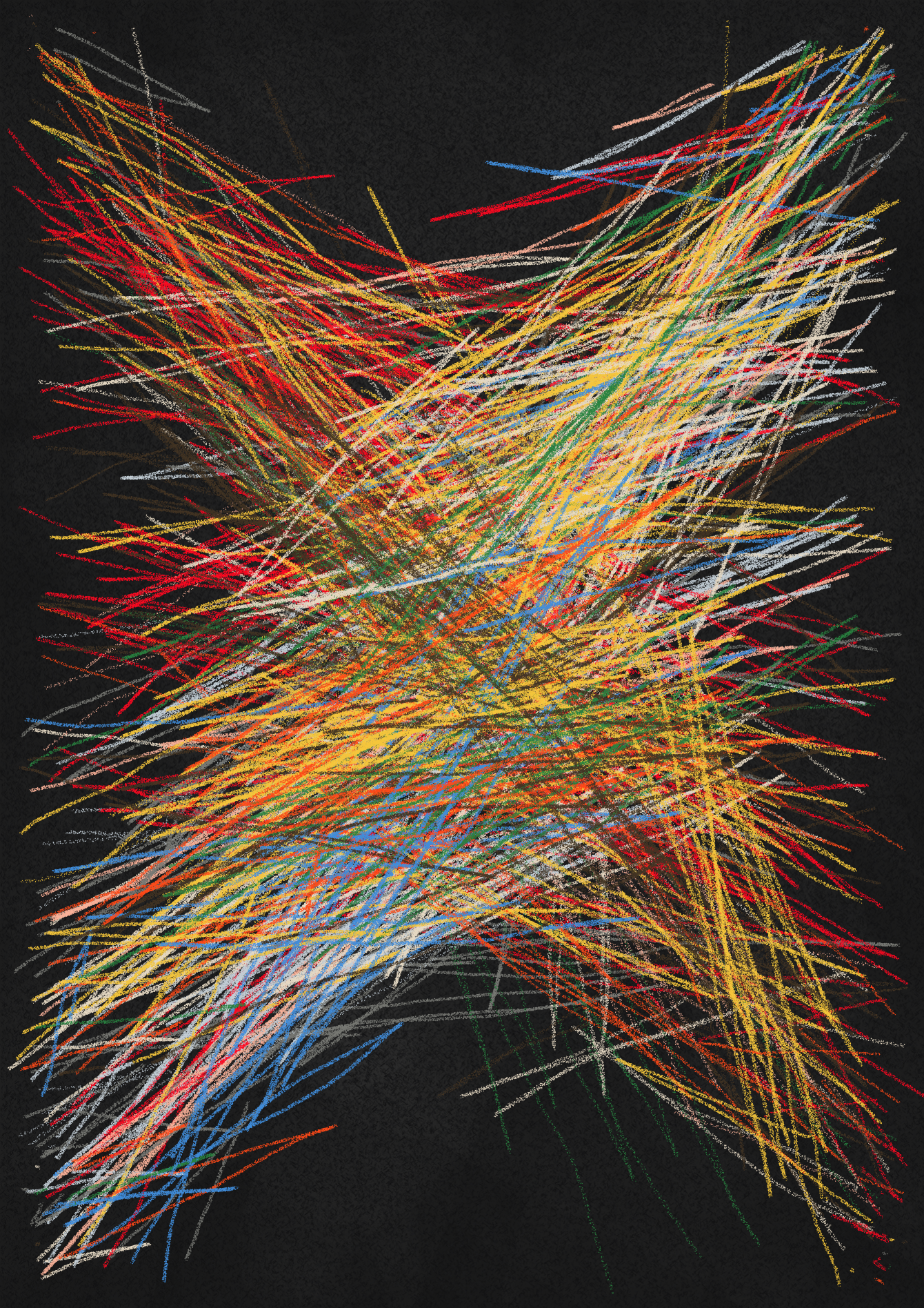
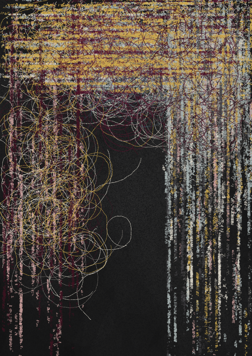
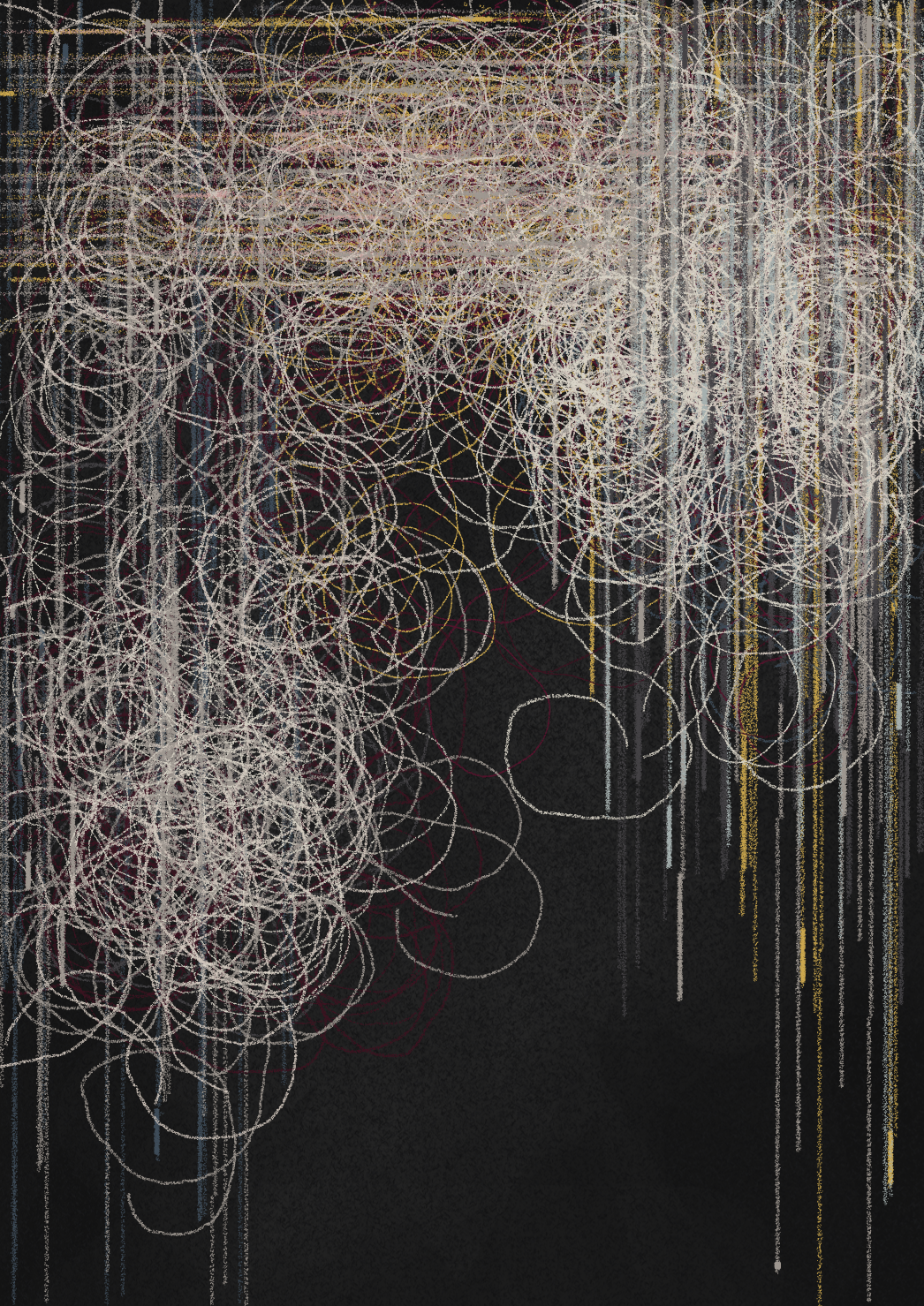
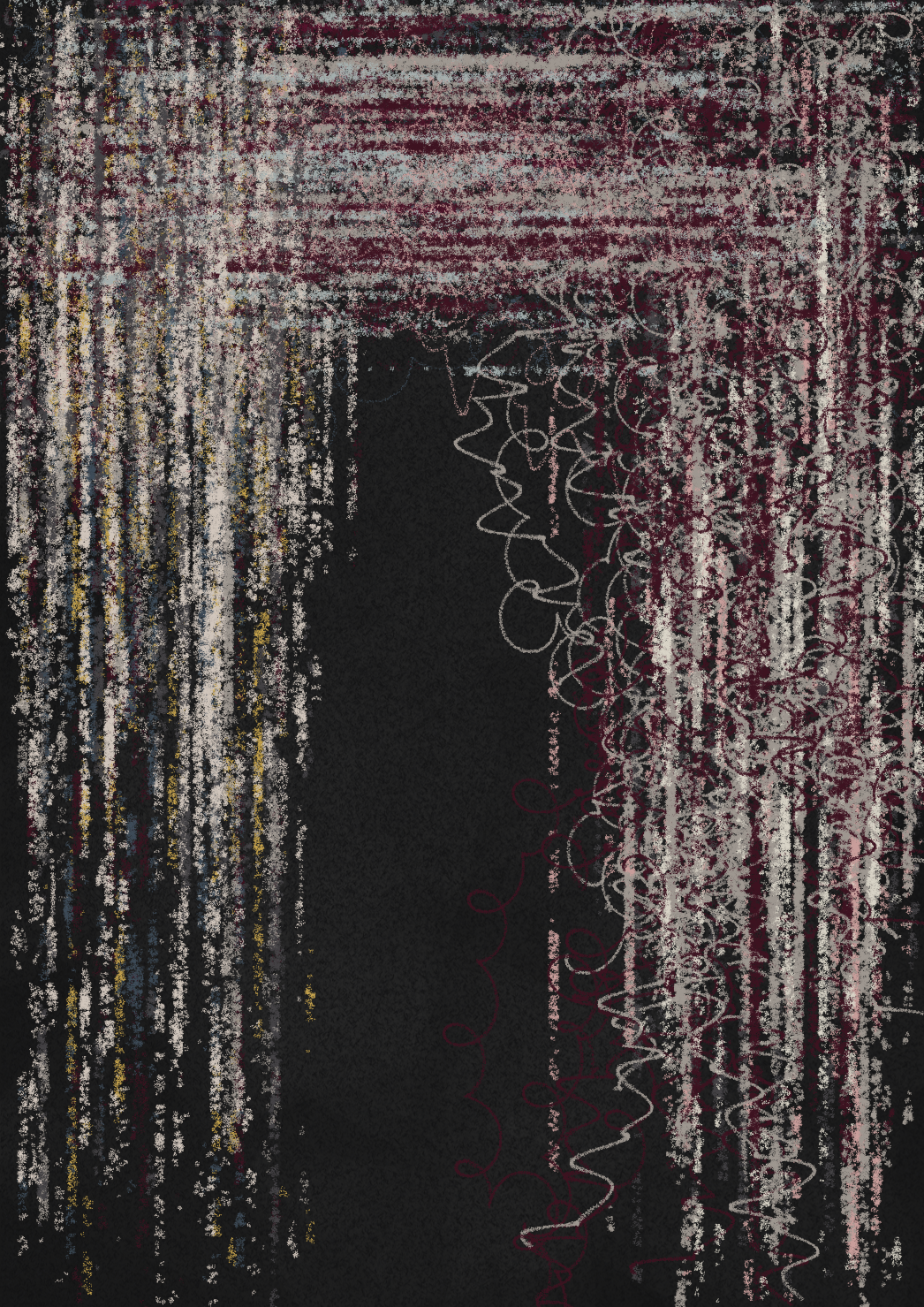
There are 27 color palettes in pang, with just a few samples shared below. Each color palette has a probability of 1-6%.
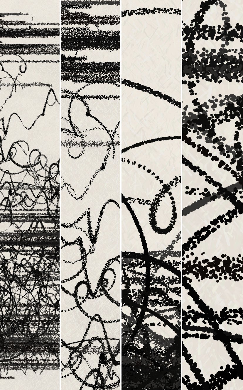
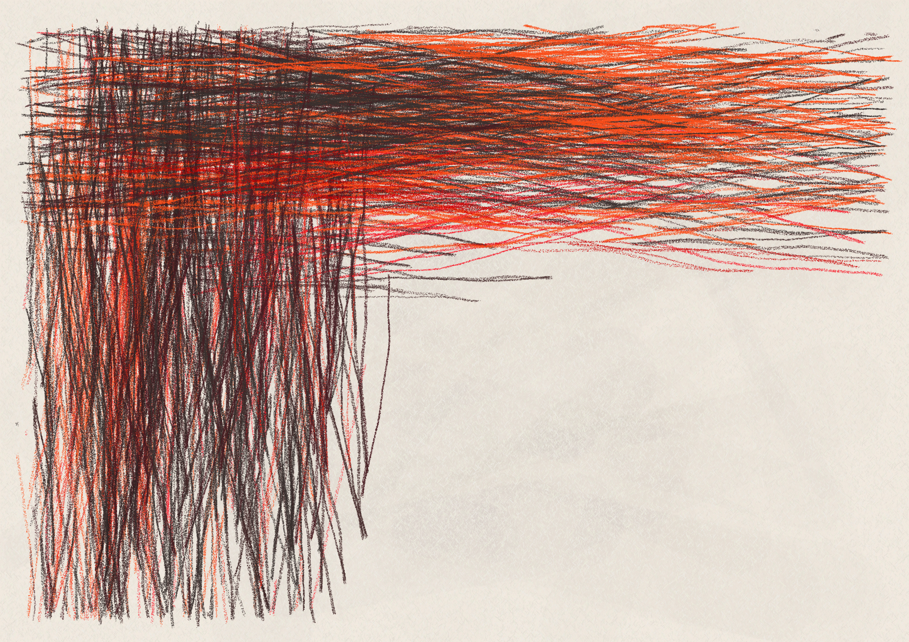
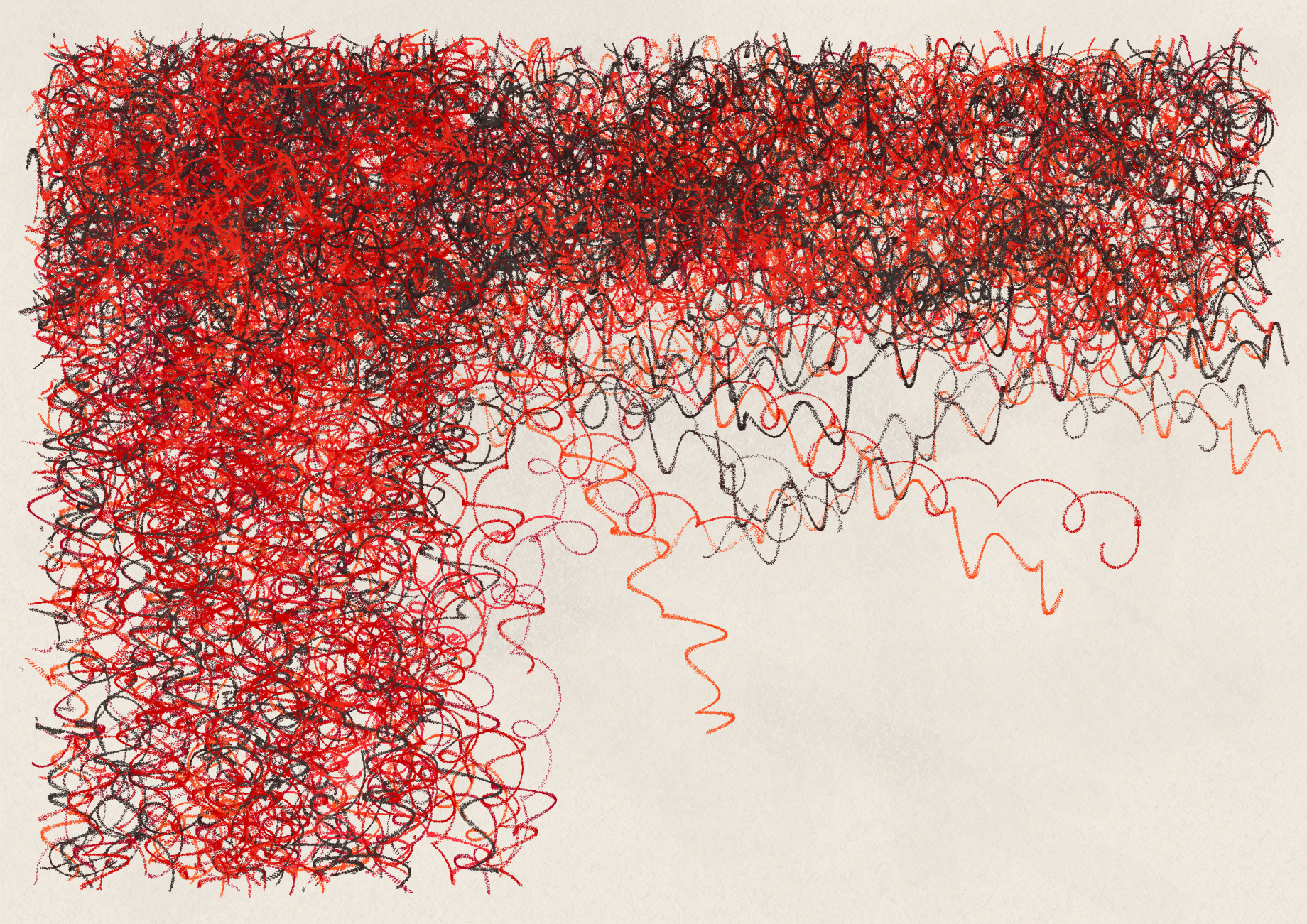
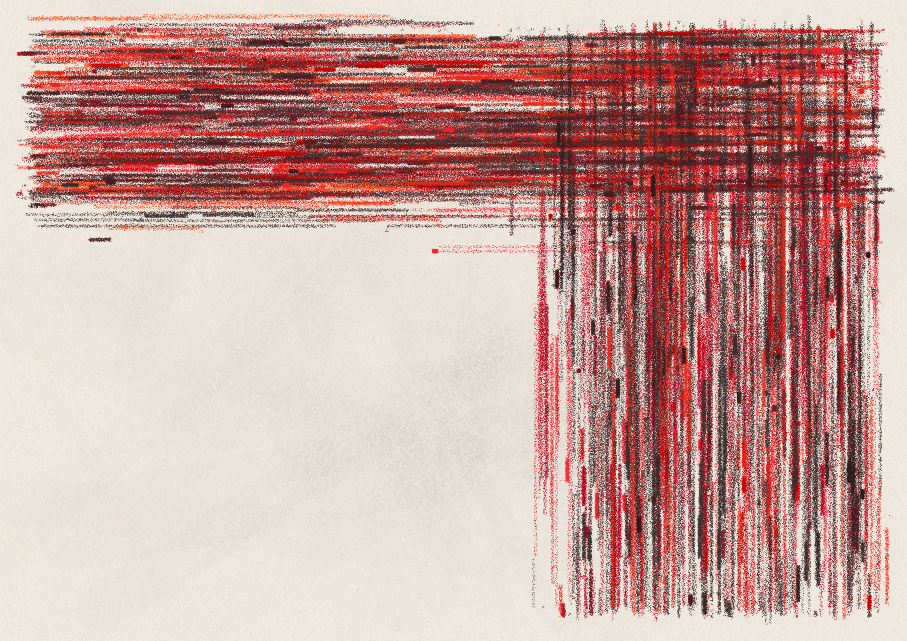
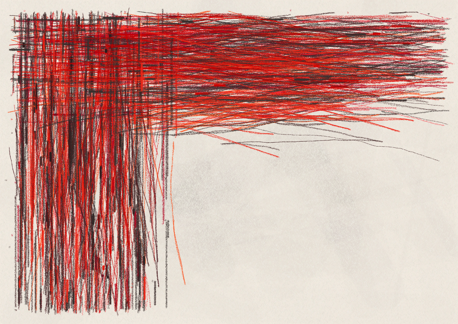
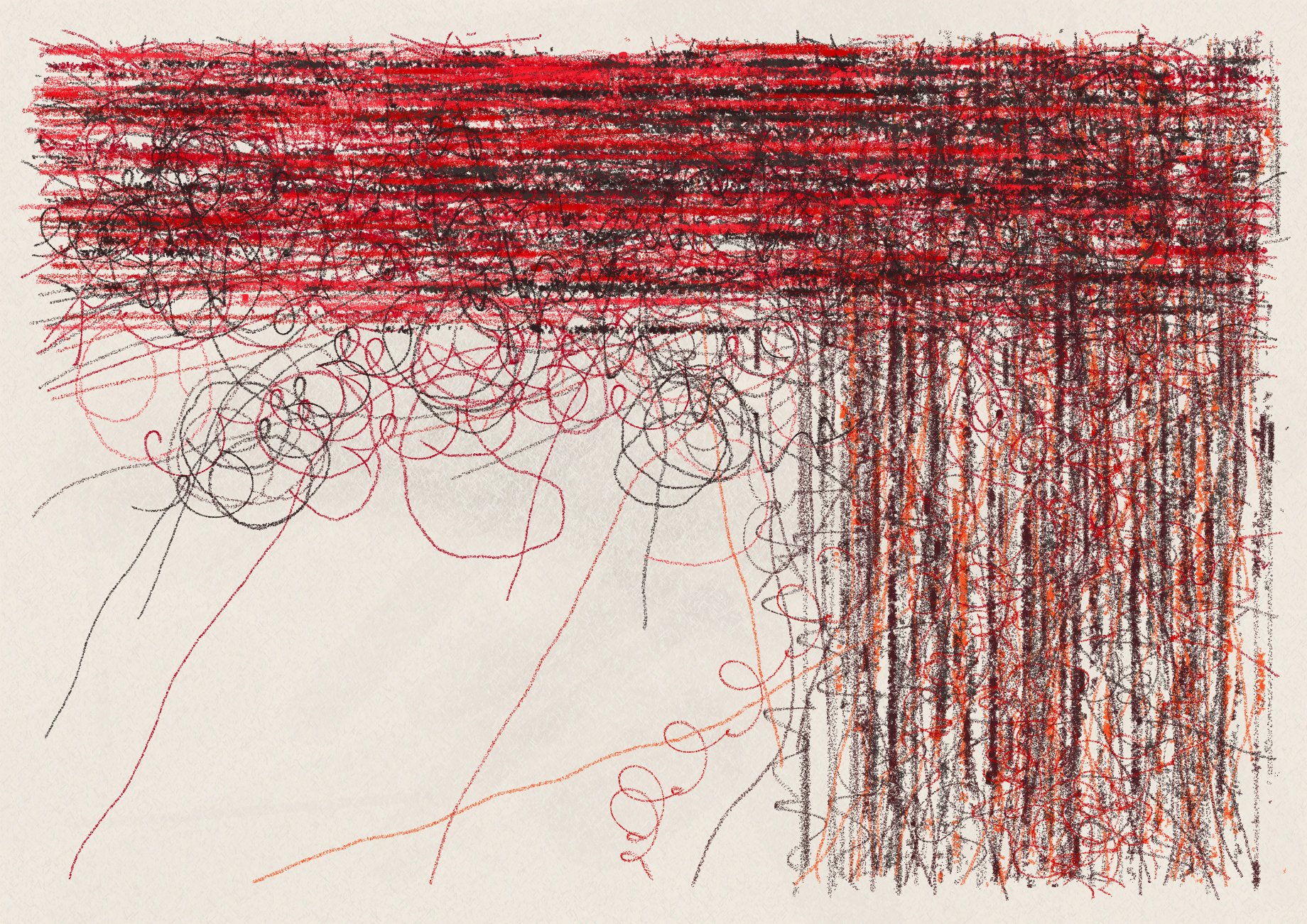
stroke technique
These two groupings—hand drawn and mechanical—drive how the varied outputs are created with one of each being randomly assigned.
palette shown: gehenna
loop
18%
hand drawn: loose circles/loops that occasionally unwind
line
15%
hand drawn: aggressive back and forth
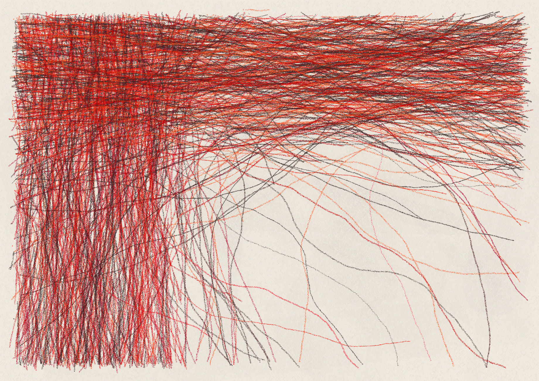
meander
7%
hand drawn: smooth, thin, and less intentional
zig
15%
hand drawn: thin, smooth, and compulsive with varying angles
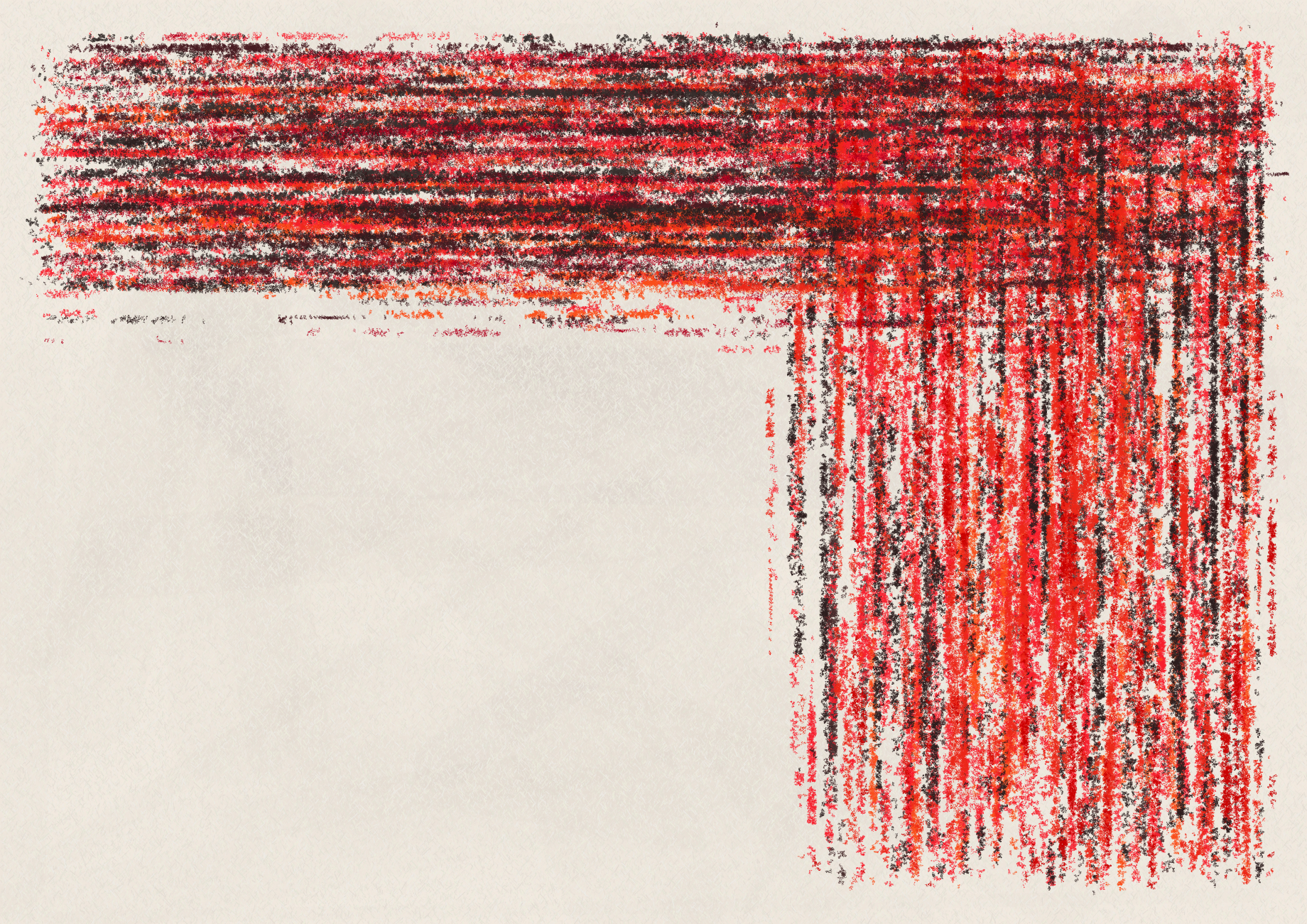
rub
15%
mechanical: a crayon laid flat and rubbed thick & soft
edge
7%
mechanical: a thin, stuttered & sharp crayon edge
varied
10%
combination of one hand drawn and one mechanical
max(Varied)
6%
combination of all techniques
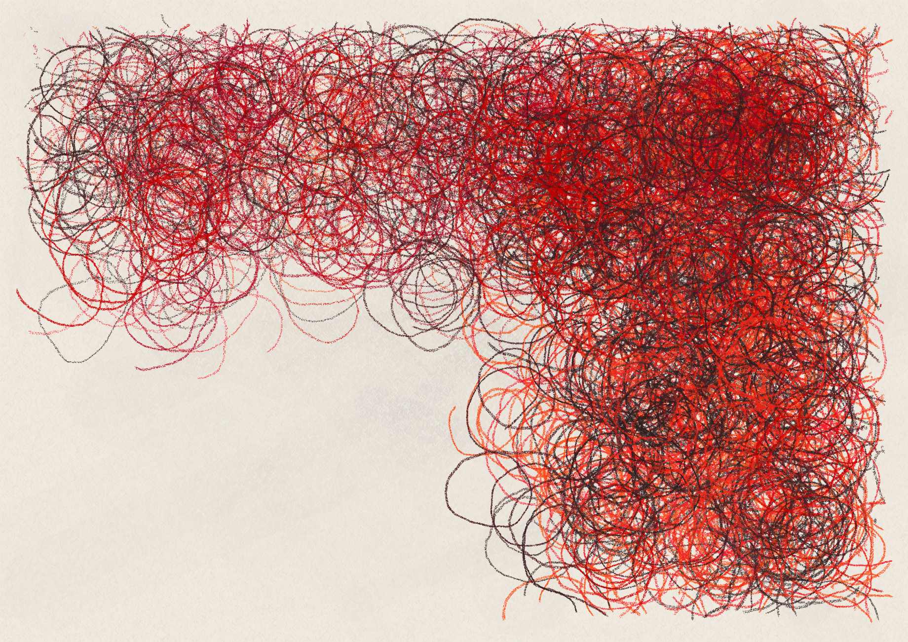
instruments
While the following samples do not combine the different instruments, this happens regularly in the outputs.
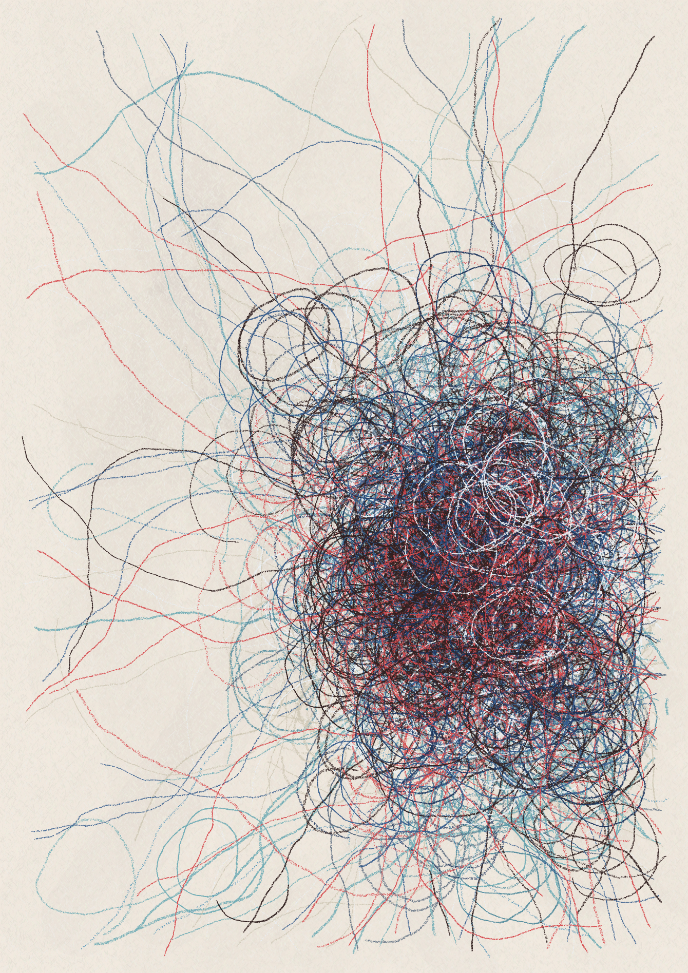
palette shown: woe
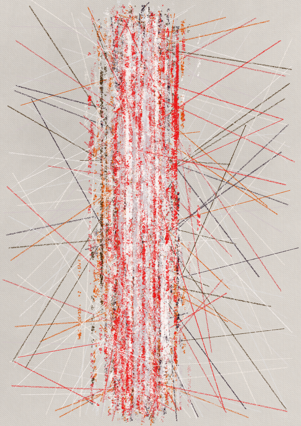
ruler
35%
far reaching, straight lines at random angles
compass
35%
perfect circles that stick close to their compositions
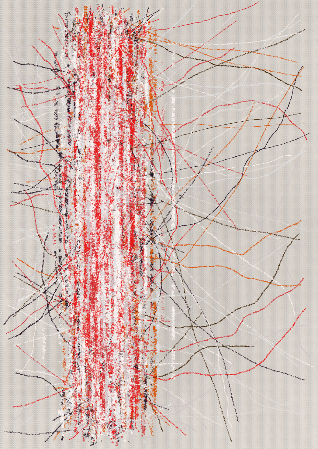
freehand
15%
far reaching, meandering lines at random angles
none
15%
negative space
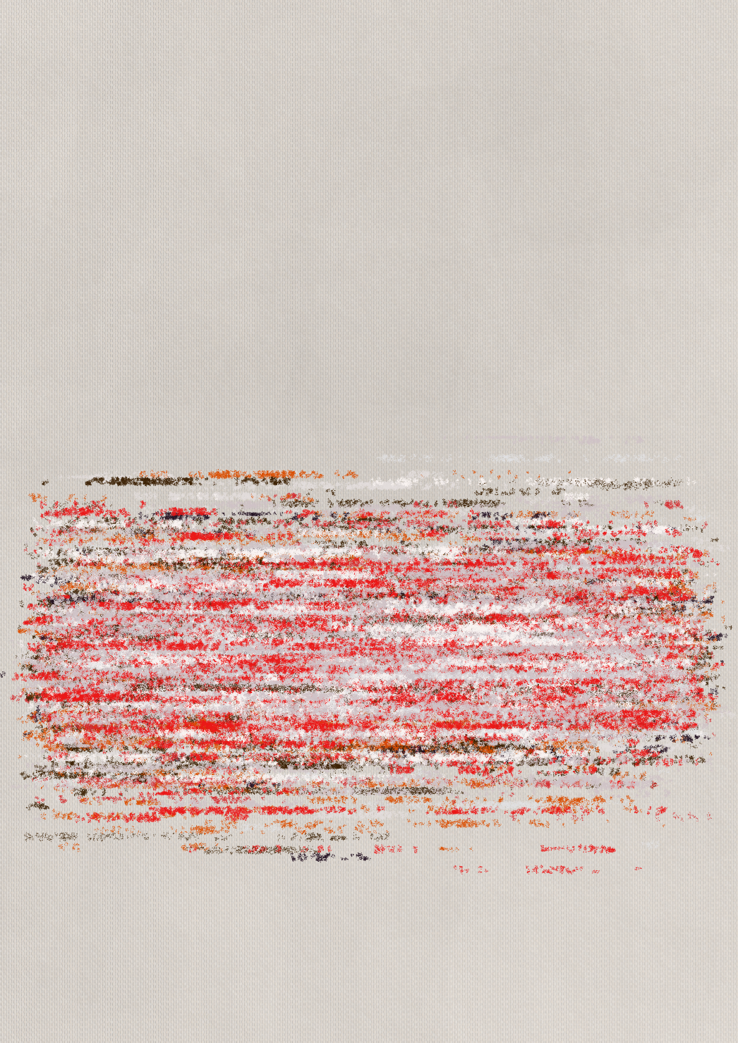
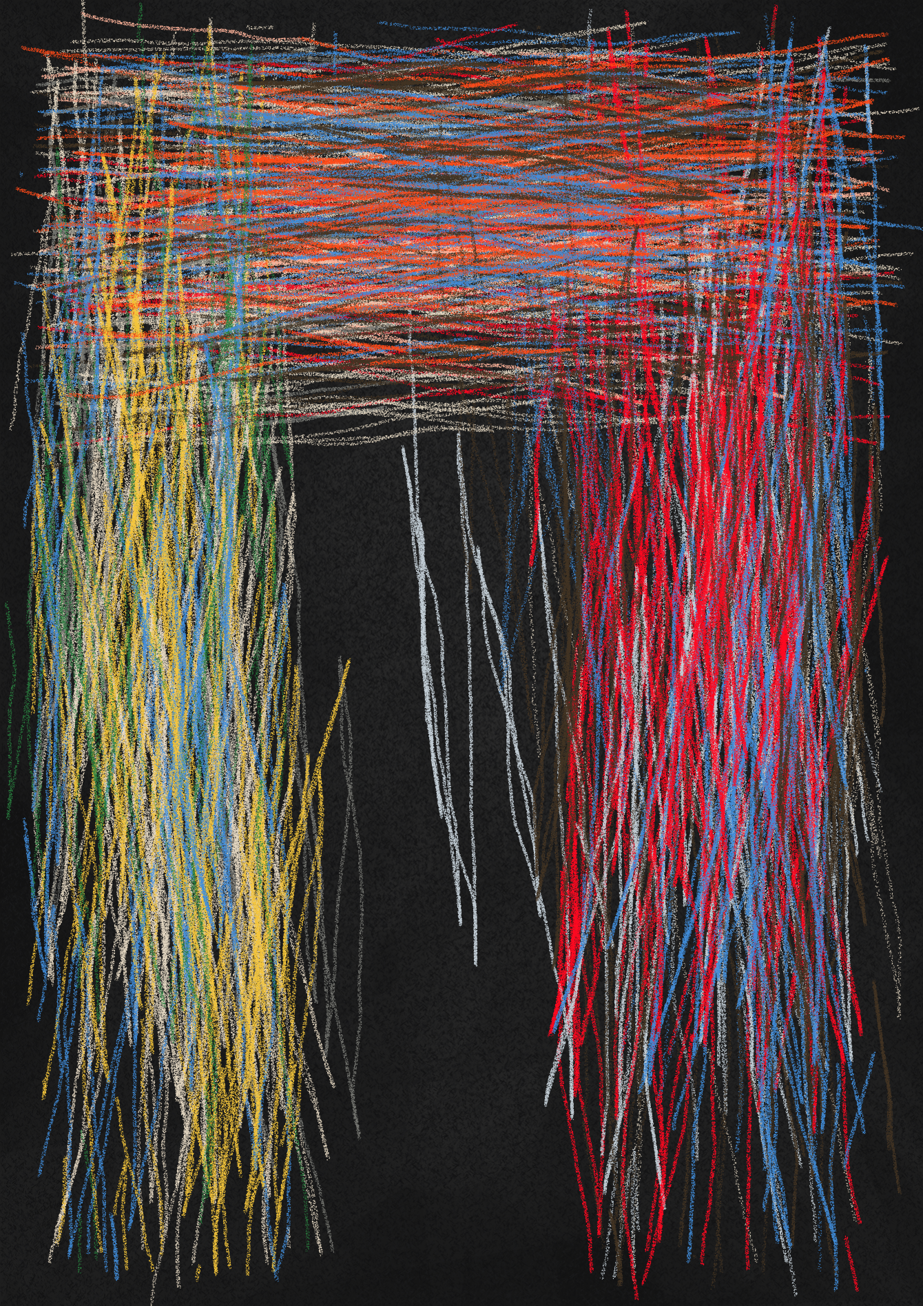
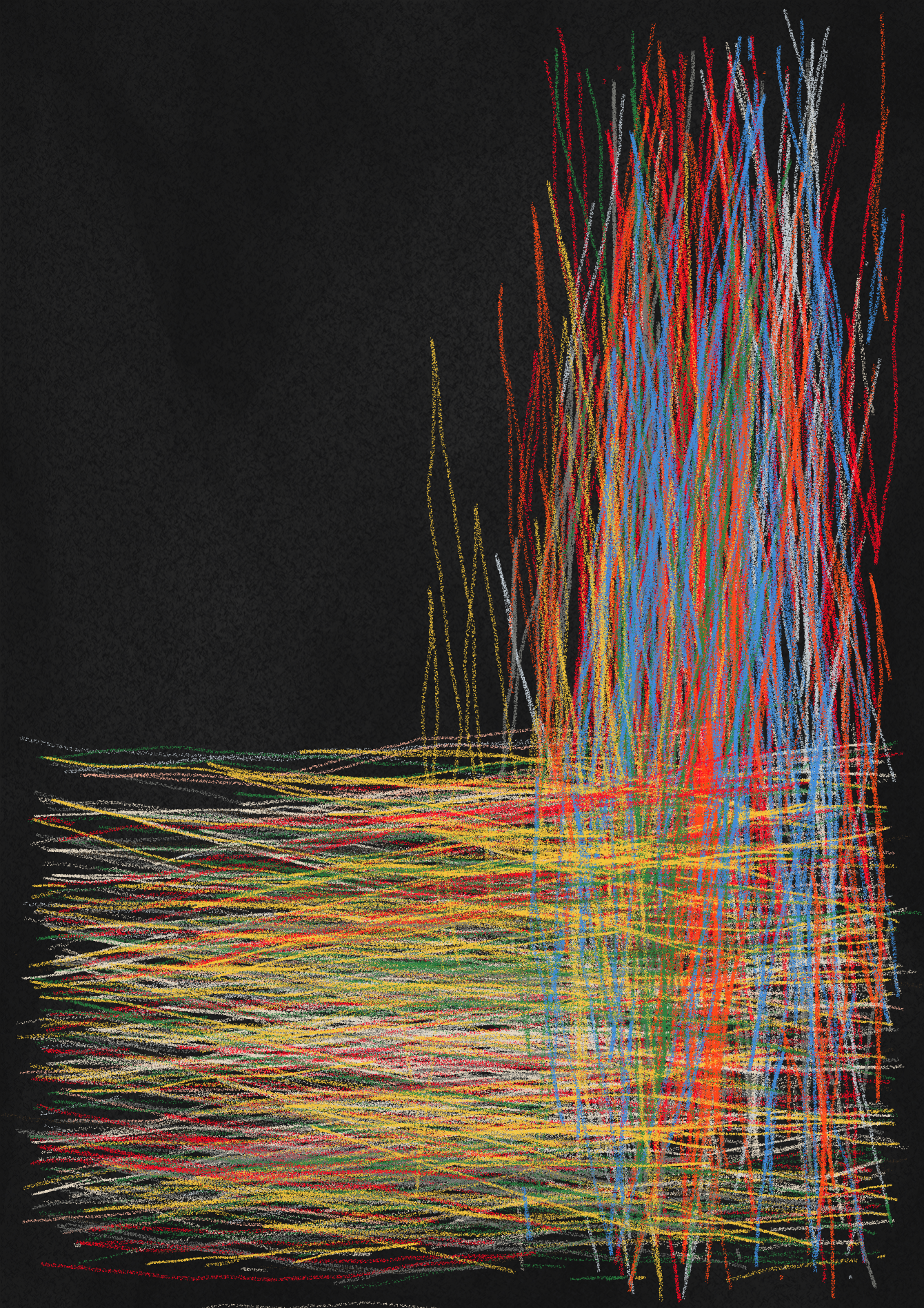
compositions
palette shown: riant
steelyard
5% each
balanced scales
2% each
ell
8% each
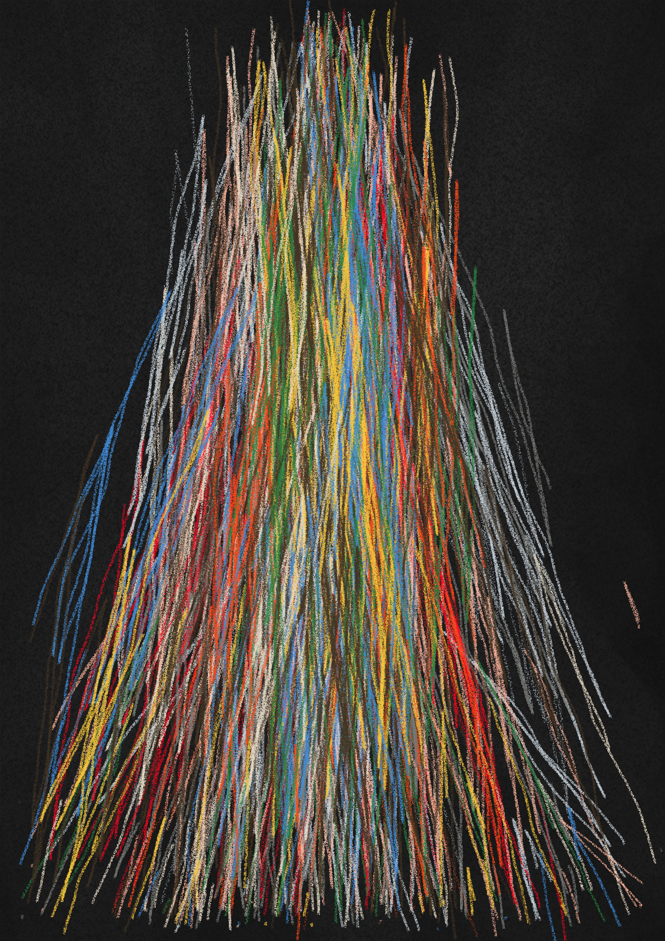
pyramid
2.5% each
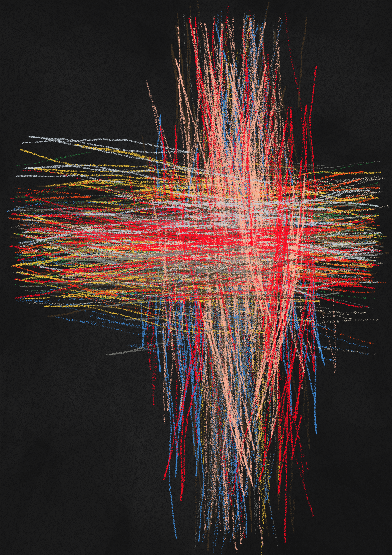
cross
2%
bar
1%
bar bar
8%
radiating
5%
three spots
5%
diagonal bar
6%
anywhere
12%
scattered masses
5%
o
8%
x
2%
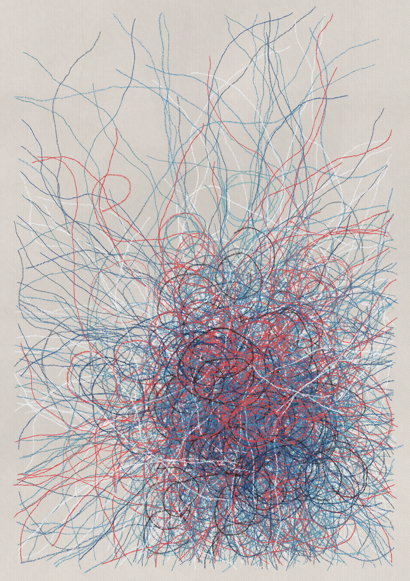
paper
As we considered paper options, we decided collectors should be able to print on their own textured paper, as if the crayon marks were applied directly. Therefore, by clicking 'B' in live view you'll be able to render the output with a transparent paper setting.
palette shown: vulnerable
newsprint
20%
canvas matte
20%
inverted newsprint
30%
black craft
30%
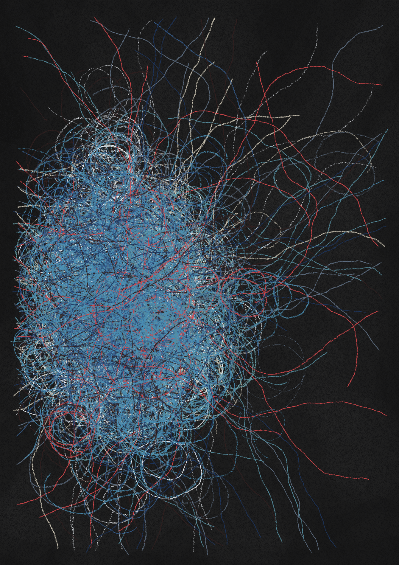
color order
Note that there are some color palettes which have dark colors (or all the same colors) on both sides of the palette.
palette shown: benevolent
light first
85% on light paper / 5% on dark paper
dark first
5% on light paper / 85% on dark paper
mixed
10% on all paper
orientation
palette shown: congruous
portrait
50%
landscape
50%
frame & frame definition
When the border is on, it applies either a rough or clean definition to the frame.
palette shown: placid
on & clean
49%
a natural, closely followed frame
on & rough
49%
a natural, loosely followed frame
off
2%
unrestricted mark making
printing
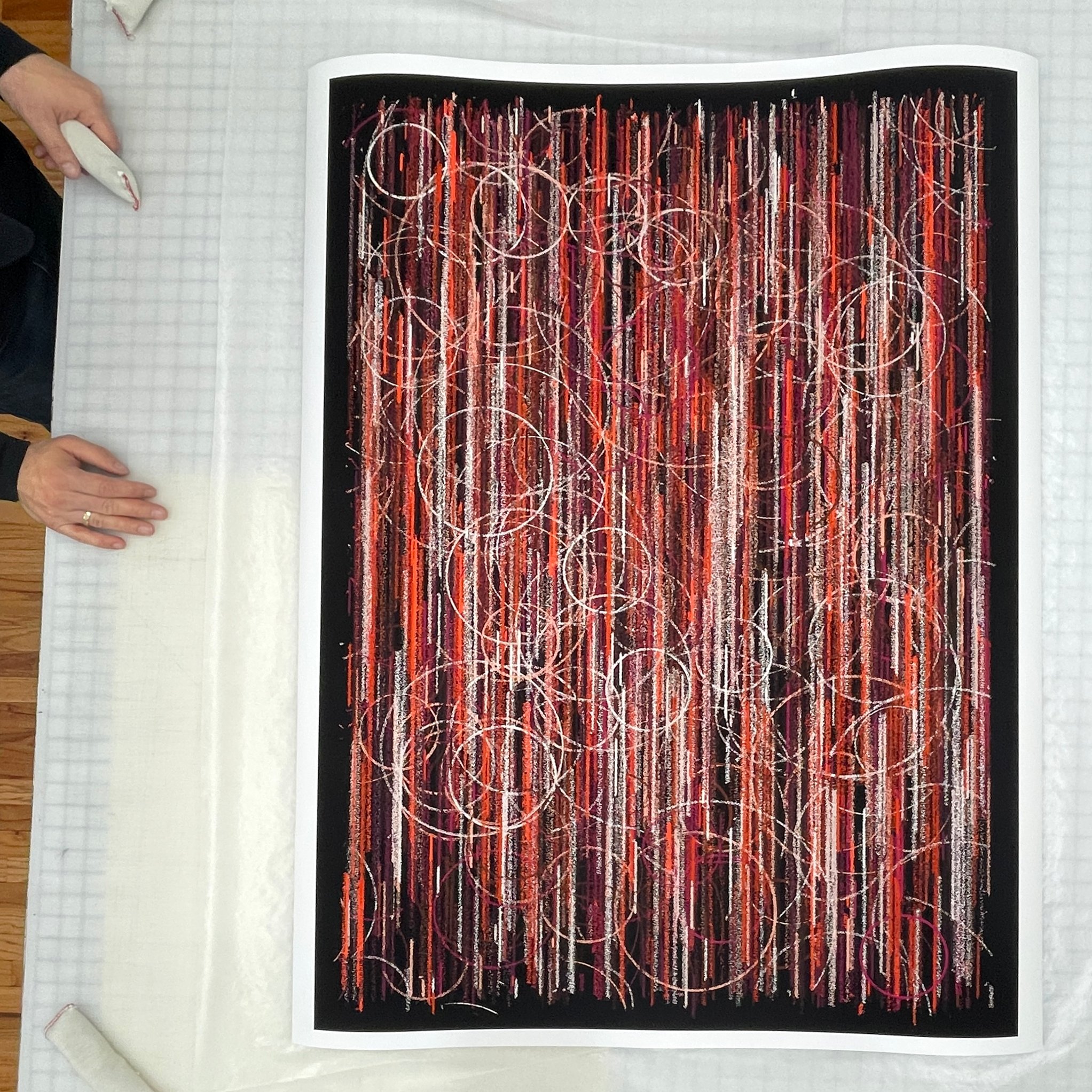
Whether printing at a scale that mimics real crayon strokes, or enlarging to accentuate their generative origins, pang will maintain its exactly intended composition and feel. The algorithm is capable of outputting up to 15,000 pixels on the long side.
To make fine quality printing more accessible, Tender has partnered with one of the best fine art printers in the world to make exceptional pigment prints. Each artwork is printed on quality Hahnemuhle uncoated or coated paper (up to 42" on the short side) and safely delivered throughout the US and Worldwide.